

For years Tazo teas have had the most beautiful package design. I loved the exotic, visually tribal groove of their tea products which always made me feel as though I was sitting with a chief in some remote village in Asia, having a cuppa. In those days, their motto was "The Tao of Tazo." I loved the typography, the crosshairs in the "o,"the kitchy language, and the teas came in a rainbow of colors. Their website was so creative and interactive that it blew my mind. So imagine my surprise recently when I saw that Tazo redesigned their site and packaging! Sure it's a cleaner design now, but I mourn the loss of the old design which had tons of character. Now their packaging seems a bit generic.
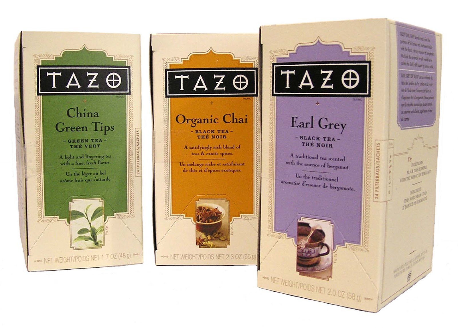
I like the older packaging (above) better...
Which do you like; old, or new (below)?

No comments:
Post a Comment
Type your comments here. If you don't have any of the accounts listed, select "Name/URL" and just put your name. Thanks!