Showing posts with label Color inspiration. Show all posts
Wednesday, August 22, 2018
Friday, June 8, 2018
Color inspiration—dahlias
How lovely are these dahlias in shade of demure pinks and apricots? No bold fuchsias here—grabbing attention and stealing the show—just dainty ladies in their frilly dresses, all getting along at the ball. The colors remind me of frosty sweet sherbet.
To see more colors, click on the red "color inspiration" label below.
Sunday, May 13, 2018
Color inspiration—lilacs
The lovely lilacs are coming into bloom. Could spring ever be complete without sniffing the heavenly aroma of a lilac blossom?
I snapped this photo at a Market in Paris on my last trip there. This old woman was shouting her heart out for people to buy her lilac and lily-of-the-valley bouquets. If we weren't leaving in a few days I surely would have bought some from her.
Friday, July 21, 2017
Color Inspiration: mixed border
Holy smoke—that's a whole lot of scrumptious color and texture happening here. The giant rhubarb leaf alone has that rusty mauve groove happening, and the leaves of the deep purple huchera (coral bells) is divine.
Tuesday, June 13, 2017
Color inspiration—In the pink
Tuesday, April 18, 2017
Color Inspiration—ripe apricots
Pow! How about those colors?
Ripe apricots looks irrisistable against a turquoise tabletop
To see more colors, click on the red "color inspiration" label below.
Saturday, April 8, 2017
Color Inspiration— scrumptious garden
I'm still dreaming of spring, and until ours arrives I'll have to settle for colorful photos and paintings of flora. American artist Childe Hassam painted these sorts of wonderfully detailed paintings, of the seaside and of gardens. This is one painting he produced in a friend's garden on the Isles of Shoals. I love the delicate splashes of color against the greens and blues, which really help the background recede. To me this garden is scrumptious—truly, truly scrumptious.
To see more colors, click on the red "color inspiration" label below.
Thursday, June 23, 2016
Color Inspiration—greens + irises
I really do see the world in colors. It's thrilling to me when I come across two seemingly disparate images within a few days' time—in this case, a photo of edible greens and a painting of a patch of irises in a garden—that both comprise a very similar color palette. In my next garden painting, I'll just have to use these sublime colors.
Claude Monet's 'Irises'
To see more colors, click on the red "color inspiration" label below.
Tuesday, March 1, 2016
Color Inspiration—Delacroix's Lion Hunt
March—in like a lion...
This is a detail of Eugène Delacroix's, Lion Hunt. Just look at the sumptuous colors that he used in this painting, created in 1861. I am in awe of the colors and brushwork, and energy, not to mention the dramatic lion scene. The subject of felines in the wild was one that really interested Delacroix. I've seen this painting at the Art Institute of Chicago—it's quite spectacular.
To see more colors, click on the red "color inspiration" label below.
Tuesday, February 9, 2016
Color Inspiration—shades of winter
Impressionist Alfred Sisley died on this day in 1899. He was a landscape painter who worked in the style of Pissaro and Monet. This painting—The Watering Place at Marly-le-Roi—uses colors that we see throughout the winter. Gray and somber to some, I think the colors are lovely.
To see more colors, click on the red "color inspiration" label below.
Sunday, November 1, 2015
Color inspiration—Scottish heather
This is one of my favorite photos that we snapped in the Isle of Skye during our recent two-week spin around the Scottish countryside. (Hi Sheep!) What a beautiful country. The hillsides weren't just speckled with heath and heather plants—they were magnificently swathed in it. Although we have a small patchwork of a heath and heather garden in the front of our house, it's not quite this colored heather, which I seriously covet.
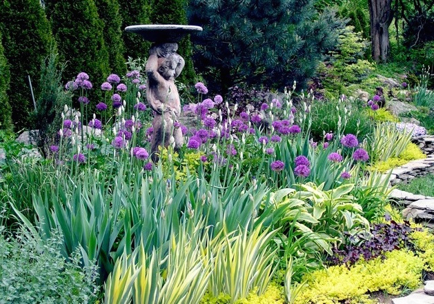
I sway towards these purply-mauve colors in my garden anyhow. Below is one of my flower borders in the spring, with alliums in full bloom, and two species of irises that are not too far behind and ready to bloom. This fall I planted heaps of mauve colored tulips in this flower border, so next spring it will be a symphony of mauve and purple colors, which—I hope—will remind me of this particular spot in Scotland... minus the sheep.
To see more colors, click on the red "color inspiration" label below.
Thursday, July 30, 2015
The color squash blossom!
Inspired by... the color squash blossom.
The Veuve Clicquot balloons are festive,
and I love Cecil Beaton's advice....
Be daring, be different!
To see more colors, click on the "color blocks" label below.
Wednesday, May 27, 2015
Color Inspiration—wisteria
Thursday, April 9, 2015
Color inspiration—a melange of blues
This magnificent melange of blues is a sky detail from Vincent Van Gogh's View of the Roofs of Paris. It's so modern—and crazy to believe that it was painted in 1886. The colors, texture and overall intensity are very inspiring.
To see more colors, click on the red "color inspiration" label below.
Sunday, April 5, 2015
Color Inspiration— WM's Tapestry
Click to enlarge.
To see more colors, click on the red "color inspiration" label below.
Tuesday, March 31, 2015
Color Inspiration—Swiss chard
Swiss Chard is easy to grow and great in the garden for eating of course, but it also looks impressive en mass as a bold and colorful garden design element. Try planting some in your flower bed. Here they look nice and springy!
To see more colors, click on the red "color inspiration" label below.
Tuesday, March 10, 2015
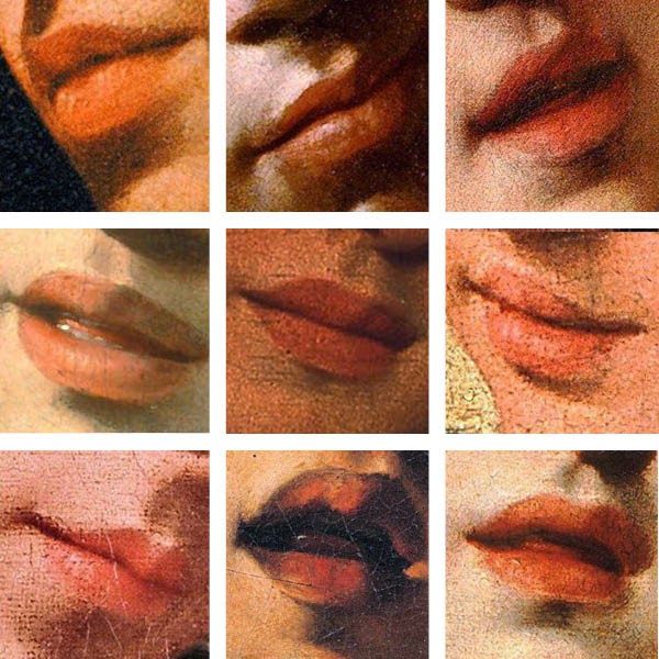
Color inspiration—Caravaggio's lips
Carravaggio used these lovely
blush pink and peachy colors so well.
Looks like a Revlon lipstick ad, but really, I'm
just dreaming of those first blooms of spring.
To see more colors, click on the red "color inspiration" label below.
Friday, February 27, 2015
Color inspiration— reflecting on white
Click to see larger image
White reflects all
the colors of the visible
light spectrum to the eyes.
The left photo was taken on a cloudy day, so the white colors and shadows look gray. We all know how white (ish) snow can look on a bright, sunny day, but yet, look at those gorgeous shades of grayish blue!
The middle photo was taken in a room with orange walls, and sunset, hence the darker beige hues. (You'll just have to trust me that the curtain and sculpture is actually white.) On a bright day this scene looks much whiter, and yet, look at those gorgeous shades of pinkish beige!
The right photo was taken after a snowstorm, in the shade, so the shadows looked very blue. Again, we all know how white (ish) snow looks on a sunny day, but yet, look at those shades of blue!
Click on the red color inspiration label below to see more colors!
Monday, February 9, 2015
Color inspiration—gilded bliss
In my eye, these five seemingly disparate art works are connected by one sure thing … color! Just look at the glorious golden glow of these widely varied paintings and sculpture. Clockwise from top left are: J.M.W. Turner's Sunrise with Sea Monster, The Winged Victory of Samothrace, from the Musée du Louvre, Catherine Kiernan's abstract piece titled Refractions, and Jamie Wyeth's Shorty. It's all visual harmony and gilded bliss.
Tuesday, January 20, 2015
Color inspiration—magenta + yellow
Nothing like a little splash of happy in the dead of winter!
To see more colors, click on the red "color inspiration" label below.
Subscribe to:
Posts (Atom)